
It's half past midnight on New Year's Eve here in the midwest (which is pretty well recovered rom the ice storm now, just a little debris still laying around). 30 minutes ago there was a godawful cacaphony of explosions all across this little city, part fireworks and part gunshots. The streets are careening with drunks and clogged with cops - a great night to stay in and blog! Welcome to my appreciation of the wonderful structures and textures of Sergio Leone's Dollars trilogy. This was sparked because I just caught For a Few Dollars More (yet again.... it gets shown six times for every time they show Fistful or Ugly) - twice today actually! I've always loved these spaghetti westerns, in particular the Dollars trilogy, and the buildings are a huge part of that.
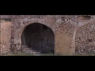
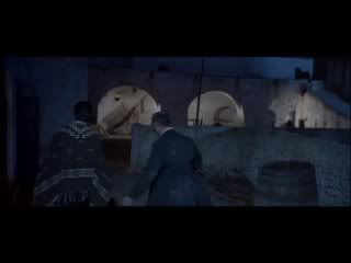
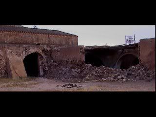
If you recall, in my analysis of the scene from Street of Crocodiles a while back I mentioned the fact that the Quays built a complex and mysterious space, as opposed to the simple clearly defined rectangular space from the Tool video Prison Sex. Well, here's the live-action counterpart... and I don't think I've ever seen a film featuring more organic structures. In fact the only other place on earth I can think of that has buildings as flowing and earthy as Mexico would be the Middle East, which has similar mud brick structures covered with plaster. I wish I had better screengrabs, I just had to find these online (at BTInternet.com~ Spaghetti Westerns Locations). It's amazing what buildings like this do for a film.... normally in this modern world we're moving through buildings made in the traditional rectilinear formula... all straight lines and square angles. How refreshing to see these handmade, rounded buildings, with unexpected surfaces and rough earthy textures. It's more like a series of grottoes and caverns than the usual boxy buildings - there are spaces that creep up on you suddenly, little alcoves and cubbyholes and chambers and tunnels at various levels and angles. And part of the charm is the materials... the mud brick and mud plaster and natural wood. I became obsessed after seeing this film earlier with discovering whether the buildings were real locations or sets built there in the desert. I couldn't find anything about it, until just now I ran across that site when I was looking for pics for this bloggage. But according to that site, they must be actual locations, and many of them are still standing virtually unchanged! I guess that makes sense... it was low budget after all, no money for erecting villages and houses. These spaces remind me of the mockup sets Sven made a while ago. They also remind me of some of the coolest sets I've seen in films.... Caligari, The Golem, Oliver Twist, The Blue Angel, Ivan the Terrible, The Neverhood, Grey Wolf and Little Red Riding Hood etc. When you use sets like this you allow for mystery, where as in a square room where every corner is in plain sight there is none.
As I was searching for info about the locations in these great flicks, I ran across a couple of great Roger Ebert reviews: For a Few Dollars More and The Good the Bad and the Ugly. The first is a very brief review done in 1967 upon FaFDM's initial release, and the second a much more in-depth (and much more positive) one done in 2003. He's obviously come to appreciate and enjoy the films a lot more in the interim. Here's what I like about the first review....
"For a Few Dollars More, like all of the grand and corny Westerns Hollywood used to make, is composed of situations and not plots. Plots were dangerous because if a kid went out to get some popcorn he might miss something.
So Westerns had situations, instantly recognizable. The man in the black hat strikes a match on the suspenders of a tough guy at the bar. Two gunmen face each other at each end of a long alley.
"For a Few Dollars More" has lots of stuff like that, but it's on a larger, more melodramatic scale, if that's possible. Shoot-outs aren't over in a few minutes like they were in "High Noon." They last forever."
- And here's what I like about the second one:
"A vast empty Western landscape. The camera pans across it. Then the shot slides onto a sunburned, desperate face. The long shot has become a closeup without a cut, revealing that the landscape was not empty but occupied by a desperado very close to us.
In these opening frames, Sergio Leone established a rule that he follows throughout "The Good, the Bad and the Ugly." The rule is that the ability to see is limited by the sides of the frame. At important moments in the film, what the camera cannot see, the characters cannot see, and that gives Leone the freedom to surprise us with entrances that cannot be explained by the practical geography of his shots.
There is a moment, for example, when men do not notice a vast encampment of the Union Army until they stumble upon it. And a moment in a cemetery when a man materializes out of thin air even though he should have been visible for a mile. And the way men walk down a street in full view and nobody is able to shoot them, maybe because they are not in the same frame with them.
Leone cares not at all about the practical or the plausible, and builds his great film on the rubbish of Western movie cliches, using style to elevate dreck into art. When the movie opened in America in late 1967, not long after its predecessors "A Fistful of Dollars" (1964) and "For a Few Dollars More" (1965), audiences knew they liked it, but did they know why?"
I knew I liked it, and I knew some of the reasons why, but I hadn't thought of it in quite the way he revealed in this review. Now the wheels are turning in my head.....
Here's another great site I stumbled across (some time ago actually, and then again recently): Fistful-of-Leone.com, where I found this delightful little anecdote -
"Another interesting note is that this is the first film that contains what is to become a Leone trademark, the musical theme embodied within the movie itself, where the music is often both diagetic and non-diagetic (within and seperate from the action). In this film, the musical theme is a pocketwatch that plays a simple tune which starts and blends with the Morricone non-diagetic music. In Once Upon a Time in the West the device is a harmonica. In Once Upon a Time in America the device is a pan flute that Cockeye plays (but is really played by Zamphir, master of the Pan Flute (I am not making this up)). Sometimes the tunes are diagetic, sometimes they are nondiagetic, and sometimes a mixture of both. This is distincly Leone, and I've only seen other directors use this technique once (in The Mission, again with Ennio Morricone music)."
... Note - diegetic music means music that the characters can actually hear, and non-diegetic music would be music only the viewer hears, such as theme music. I have seen this done once, in a comedy that I can't recall the name of (or who was in it or anything). The characters are driving along in a car and having a very dramatic conversation, accompanied by powerful orchestral music, which of course the audience takes for the usual non-diegetic music. Then the car slowly passes a bus carrying a symphony orchestra to some concert, and we see that they're all playing their instruments.
4 comments:
Hey, wow! When I opened up your blog and saw that picture, my immediate first thought was
"Ooh... I like that! Maybe I should steal that image and use it for a set design."
And then I read down. I'm surprised that you made the connection to my set mockups! Good call, man!
Probably part of it is that there are arches... I'm fascinated the thought of using arcs in architecture. Not sure how I'm going to go about it, but I want to make lots of sets that have arcs -- and not just straight lines -- defining spaces.
It's not just because of the arches. Actually these screengrabs fail to do justice to the architecture in the film.... here the buildings are only shown fron the outside and rather far away. I wish I could get my computer working for grabbing pics - when the action takes place inside these great spaces you can really see how powerful it is. And that's when it reminded me of your mockups - mostly because of the multi-level thing, with ramps joining levels etc. Well, that and the arches....
It's amazing what you can find online - wow.
I just listened to an interview with Clint Eastwood on NPR's freshaire.
They were talking about the music of the Leone films and how the music changes the image on the screen.
Clint brought up the fact that the Ennio Morricone score is very operatic (which I never considered - Duh)
but of course he is right watch any of those films without the sound and it is no where near as powerful.
As good as those three films are I might just like "Once upon a time in the west" even better. It doesn't have the iconic Eastwood, but instead it has Henry Fonda as a nasty bad ass dude - completely against character. Some of the scenes at the train station are amazing the way the camera work is done. His camera work is so cinematic he makes a lot of the american western movies look like a TV "Gun Smoke" episode.
Yeah, Once Upon a Time in the West is incredible... especially that long scenario on the train platform where the sounds of a creaking sign etc orchestrate into a sound track.
Heh... I just emailed Tomislav Torjanac to tell him how much I like the drawings he's posted recently, and he informed me that a capitol D with a line through it like I use in my Darkmatters title is pronounced Dj in his part of the world - as in Django (another of those great spaghetti westerns)! Weird, huh? I love those flicks and the way they're made... I'd love to use similar techniques in some of my films.
Post a Comment