Tuesday, October 31, 2006

Breakin out the brushes again

Photobucket - Video and Image Hosting
Well, actually I didn't use a brush for this, but I will be soon. Posting all the old stuff made me really want to get back to drawing, and in particular to push my painting skills to the next level (I had only just started to figure out how to paint decently when I put it aside in favor of stopmotion a few years ago). This was done over a pencil drawing using Cra-Pas, the first application turned into a wash with some Turpenoid on a paper towel. Over that I just used straight Cra-Pas and rubbed with either a dry paper towel or my fingers. I kind of like the look of it, but it's pretty hard to get any detailing at all, and the colors are really transparent. The only way I could manipulate value at all was with either a black cra-pas (crude) or with a soft pencil, which I ended up using all over, rubbing it into the oil pastels with my fingers to blend it a little.

This is the kind of drawing I could see doing as a color rough before tackling a painting, although in this case the background is just an afterthought. Before attempting a real painting I'd work it out a lot more, and push the colors till they started to look better.

The character is Fafhrd, from Fritz Leiber's Fafhrd and the Grey Mouser series, which was some of my favorite reading when I was younger. He's a northern barbarian, but he's not a total hard-ass like Conan, I always pictured him as more of a great good-natured surfer type or something (but you definitely don't want to get him pissed off!). I've decided to concentrate on him to develop my painting skills, and at the same time develop my version of the character. I also want to try to paint his partner the Mouser, a little grey-clad catlike fellow. The Mouser is Fafhrd's polar opposite, a city boy and a smooth-tongued con artist as opposed to the brawny Northerner's direct open naivety and straightforwardness. But I must say I'm having a much harder time with him.... Fafhrd is so much easier being pretty close to a stereotype we've all seen a thousand times.

The other day I got Mike Hoffman's DVD The Secrets of Fantasy Painting, which is exactly what I needed to see! If you don't know who Hoffman is, he's a fantasy painter known as almost a shameless Frazetta clone. He takes the viewer through his techniques starting with an already finished drawing on bristol board, doing the underpainting in acrylics, and finishing over that with oils. Watching the way he works was a HUGE help! I'm amazed at how direct and simple his methods are, and it looks like a very natural way to work for me. In the near future I intend to do a bunch of drawing to sharpen up my rusty skills and then start a painting that I'll document here for you my loyal readers to follow.

Oh, and maybe I'll do some work on my movie now and then too! ;)

Thursday, October 26, 2006

Two new stops on the blog trail

Last night I heard from Croatian painter/illustrator Tomislav Torjanac in my comments section, and I clicked through to his blog. Wow! A great talent! Then tonight's webquesting led me to Dreamers Often Lie, where Rob ________ (last name never mentioned on blog) writes short intense dream-related stories. I love this stuff!

And I've just found another killer site! Not really a blog, but people have uploaded their dreams to Everything2.org. I don't understand the site... it seems to be a massive disorganized hodgepodge of all kinds of things, but click on Dream Log and you can enter the screwed up dreams of random people.

Wednesday, October 25, 2006

Finished painting the arms at last!

Photobucket - Video and Image Hosting
Man, it took a long time and a lot of applications of paint to get the arms to *somewhat* match the heads! It was a matter of trial and error.... I'd mix up some paint to what I thought might look right, mix in the Pro Adhesive and a little water, dab it on the arms with a folded over piece of paper towel, and see what it looked like. Sometimes it was close, sometimes nowhere near. So after that's dry, do it all over again. At first I was having problems because all the colors had a lot of white mixed in, and the arms had this pale pastel look like they were glowing compared to the heads. Then I remembered the way to combat that is by applying watered down washes of pure color, with no white in it. And of course everything changes a little when you powder it up to get the shine off. It turns a little whitish and - well - powdery or chalky. So you have to have a little extra strength in your colors before powdering. I'm using colorless makeup powder, which minimizes the problem, but doesn't do away with it entirely.

Sunday, October 22, 2006

Shout out to HerHair

Just a quick shout out to pimp my latest discovery. Bart Van de Plas is doing stopmotion in Brussels Belgium, and while he's just getting a good start on hois project, it looks like it's going to be fantastic! Check out his blog at HerHair. Also be sure to look at his link to Beast Animation. He's done some work for them, and WOW!!!! what an impressive trailer they have on their site!

Friday, October 20, 2006

Boring art stuff, no pics (ok, I lied... one pic and links to more)

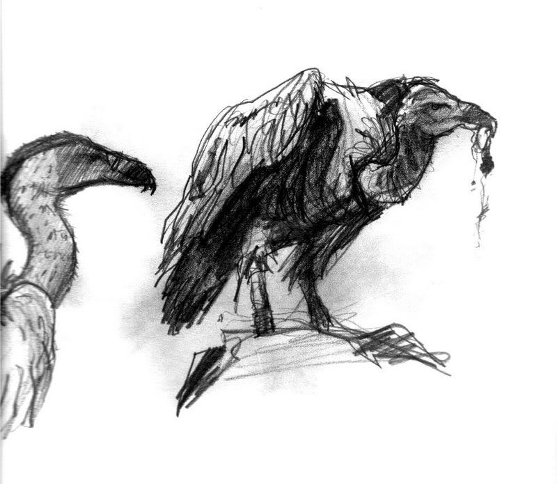
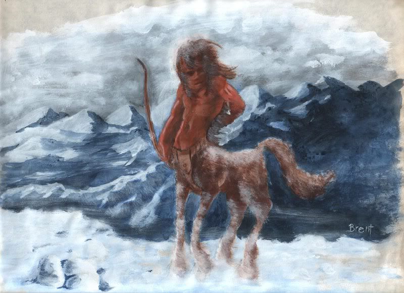
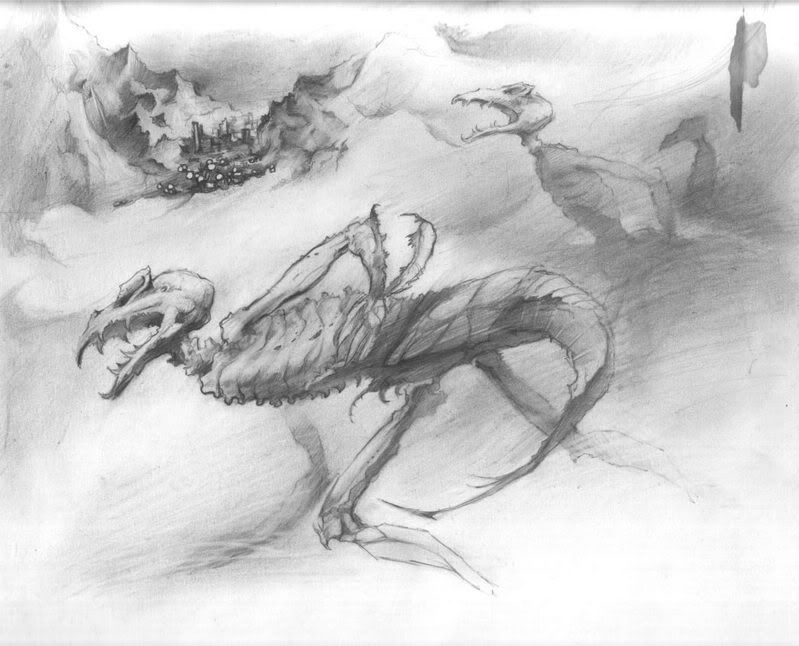
While I'm on this whole art kick I want to jot down a few of the important ideas that have helped me along the way, partly just to remind myself of them, and in case it can help anyone else. Posting all this stuff (and digging through all my old art) has made me want to get back to it again, and also I've been able to look at it all with a fresh eye and see the weak points that I couldn't see before. So I'll start with a quick critique of the stuff I posted recently and what I think I need to work on.

My main focus has always been on figure drawing. Obviously, from the first batch of drawings I posted, I wanted to draw comics at one time. Some of my greatest influences/inspirations are comic book and graphic novel artists, far too numerous to mention here. But it wasn't just American superhero type comics.... in fact my favorites were always the Warren magazines... large format black-and-white horror comics that came out in the '70's featuring mostly European artists (yeah, even then I was Euro-centric... weird huh?). Eerie, Creepy, Vampirella, The Spirit... these were fantastic!!! So much more expressive than most of the superhero stuff, and more realistic, and at the same time expressively drawn. But anyway, I can feel myself wandering away from my subject.

Ok, Critique of my recently-posted stuff:

The ones I like the best are the ones that feature either multiple characters interacting or a figure in a definite environment (where the environment is more than just a few lines in the background). And I think it's for the reason McG (Uhhh.... that's Michael Granberry) mentioned recently - because there's drama in it. There's no drama in a single character floating in space or in a mist-filled room. I also like the ones where I resisted the temptation to scribble a lot of artsy lines everywhere. Or at least keep them subordinated to the effect of the piece, and not let them destroy anatomy or solidity. And finally, I like the ones that are just tighter than the rest... I tend to draw too loose sometimes, not enough detail and not enough anatomy and proportioning. For many years my goal was to loosen up, and I did that, but now I feel it's time to tighten up again, hopefully with a new perspective I've learned along the way.

On to those tidbits and morsels of random info that have helped me in my artistic journey:

The singleshadow. My own word for a well-known concept that I learned from the invaluable Robert Beverly Hale books, the finest and most advanced drawing/anatomy books I've ever laid eyes on (and I've seen quite a few, believe me!). The idea is that all the shadows on a figure should be part of one big shadow... all serving to define the major forms. If they get scattered all over the place and no longer describe the larger form, then things are just getting confused. Helped me loads. In fact, the more I learn about advanced figure drawing, I find that learning to define those major forms is the most important step. If you can do that well enough, you've got a good drawing/painting.

The trusting line. Again, my name, and a concept that I assume is well known, though I haven't really heard of it anywhere, though a lot of artists use it or a variation of it. If you look at the last Fiona Apple drawing I posted, the one where she's singing into the mic with headphones on..... this is a good example of it. Basically you place your pencil (or whatever drawing implement you're using) and look at your reference, trying to fix the next series of curves and landmarks in your mind in relation to the entire page, and then you start the line. You keep going, confident and strong, until you've reached the logical stopping point. It's very hard to do, and you really do have to just trust that it will work, though sometimes it won't. It depends on your knowledge of anatomy and of how to draw from reference, be it from life or photoref. It helps to understand certain principles, like finding the center point of your image and the center point of the ref (easy on photoref, just place your figure exactly like the one in the pic) or just visually breaking the image area up into quarters to see what parts of the figure fall in each quarter. And sometimes, for tricky parts, you need to rely on old artist's tricks like visually aligning some part with another.... that elbow is directly under the nose etc.You really need to do these things in your mind before starting each line, and sort of visualise the line on the page before drawing it. It's easy to end up with a distorted figure this way - in fact it's hard not to, bu it usually looks cool. The trusting line is not the same as a contour drawing, where you don't look at your paper and never lift the pencil and never stop until the whole drawing is done. That's more of a 'learning to see differently' exercise, though it can produce some nice (if not realistic) drawings. This is more about boldly carving out the parts of your drawing with a strong single line, something Egon Schiele and Gustave Klimt did extremely well. My drawing used to be all fuzzy with re-drawn lines until I tried this. A key to drawing this way came to me again from Hale, when he said that the master artists of history started by learning the skeleton and all its bony landmarks (because bony landmarks don't float around the way a nipple or a belly button - fleshy landmarks - can). Then they would simply run a line, appropriately curved, from one bony landmark to the next.

Silouhette. This kind of covers a few ideas all rolled into one. My Paintings used to look like crap until I realized that an entire figure should be either light or dark. Or, in the case of someone maybe wearing a light shirt and dark pants, use contrast to make the figure stand out from the background. Your shading shouldn't make parts of the figure so dark it becomes unreadable against the background. Another factor of silouhette is that each character should "read" in silouhette, for instance if it's seen from far away as just a dark shape against a light background, you should be able to tell who it is. In a situation like this it helps to turn the face in profile (something I tend to do even close up). And here's a factor that combines both silouhette and the trusting line..... I sometimes try to simplify things so much that with just that one line I'm describing the silouhette and conveying information about anatomy and clothing. Kind of hard to describe... this is something I get from Schiele and Klimt, through Kent Williams. I'll try to find an example and post it. When i can do this, I feel like I'm drawing at the upper limit of my abilities.

**EDIT**

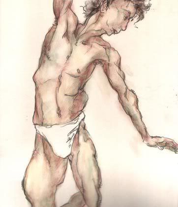
I decided to upload this pic of a drawing I did some years ago as a demonstration of how a line can describe anatomy and do something else at the same time. In looking, it seems I actually came back in and drew the hair (along forearms etc) later, but I could have done it with the trusting line as I was drawing it. In fact, studying Schiele convinced me that details can be concentrated along the line itself, since line denotes a plane change, and that's where you'll tend to see details best. It's also where color and shadow change. Worthy of lots of contemplation/study, no? (I mean the tecnique, not my drawing)
Photobucket - Video and Image Hosting
to see the kind of drawings I was trying to emulate, check out KentWilliams.com and to see what inspired HIM look at some Egon Schiele drawings.

That's all I got for now.... if I think of more later I'll post more. Jeff, you said you were thinking of learning some Photoshop technique. HERE'S a nice place to start. For coloring stuff, one of the coolest things I ever learned was how to creat a flats channel or layer. And, for anyone interested in learning about ar or improving your skills, or just seeing a whole lot of incredible stuff, check out Conceptart.org.

C-ya!

Wednesday, October 18, 2006

Dumping another load of steaming fresh artwork

Photobucket - Video and Image Hosting
I believe this was Peter O'Toole, from Born Free 2 if I remember right.... I just thought he had a cool look (sort of Posiedon-ish or something) so I recorded a bit and did another of my VCR sketches. I like doing those because you have to draw fast... you only have 5 minutes till it shuts down, and you'll never find the exact same frame again! Drawn in charcoal pencil, sealed with 2 coats of matte spray, then tinted overall blue using oil pastels washed over with Turpenoid. I love this, because even on thin paper it doesn't buckle swell or wrinkle AT ALL!!! So crazy after messing with watercolors for so long! Anyway, over that I believe I just used oil pastels, or possibly also some aquarelles. hard to tell sometimes.

Photobucket - Video and Image Hosting
Here's Tori Amos, done also as a VCR sketch. Looks like a 2B pencil (my favorite for most drawing unless I want it really dark), sealed (always seal before doing anything else... or it will smear and get all ugly. 2 coats to seal.) and again tinted blue overall, I think with areas of reds added in here and there. Then the aquarelles. I remember this one was really difficult, especially trying to build up opaque enough color on the face to almost cover that blue tint (while letting it create the overall color tint for the image).

Photobucket - Video and Image Hosting
Here we have Fiona Apple, VCR sketch taken from a Howard Stern appearance. I had this crazy thing about her for a long time... she's an incredible artist and a hottie, and she also hit the scene right around the time I met Jenni, who reminded me strongly of her. Heh... yeah. Personalitywise. Sad but true. And I didn't have any reference for drawing Jenni, so I drew Fiona. I punched up the contrast on this one digitally so the lights in the background would look right (could even be a bit stronger), and I'm afraid it kind of screwed up the image a bit. But when those lights don't pop the way they should it looks stupid. Done entirely in oil pastel wash over pencil, and some details scratched in.

Photobucket - Video and Image Hosting
Fiona again, doing her famed snakedance routine she always did in the song Criminal. I thought it was a cool pose, almost like something from a Symbolist painting. This one is drawn on paper, sealed, and then painted with Alkyd paints. Alkyds are synthetic oil paints, they act almost exactly like oils except they dry faster and more uniformly.

Photobucket - Video and Image Hosting
And here's Jennifer Anniston (not supposed to be a likeness, just a quick sketch done from a Friends freeze frame). Just playing with coloring methods again and trying to draw like my idol Kent Williams.

Photobucket - Video and Image Hosting
And finally, here's an expressionistic drawing of Jenni (maybe a little TOO expressionistic!). I believe this is just pencil and oil pastel.

Tuesday, October 17, 2006

Welcome to the Candybox

Photobucket - Video and Image Hosting
Yum yum!

No, I wasn't just hungy today, I want to talk about color in painting/drawing. This is something I've been thinking about doing ever since I started posting my artwork, because it's been vitally important to me in learning color theory. Then Sven asked about my painting methods under my last post, so I decided it was time.

I struggled quite a bit with color - still do, but at least now I have an effective way to approach it. Several ways actually, but this is one of my favorites. I call it the Candybox. See, the idea is to have a box or palete loaded with lots of colors right in front of you, so it becomes easy to see exactly what color you want to use next. I used to just load up a palette the standard way... a few blobs of color covering the primaries and secondaries, and then leave enough room to mix variations on them. But somehow i always ended up with dull paintings using pretty much the same very limited selection of color. Until I got a half-pan set of watercolors that is, originally with the idea of going out and painting on lacation like an impressionist (yeah right... like I was really gonna do that!). But what happened instead is that, once I had this huge box of colors open in front of me, it became easy to make quick intuitive choices and end up with a rich balanced painting.
Photobucket - Video and Image Hosting
So I started getting other "candyboxes" to extend my capabilities, like a few sets of pastels and oil pastels, and then one of my personal favoites, a huge set of Aquarelle watercolor pencils. I think I've actually got my best results in oil pastels and aquarelles. Especially once I learned that you can blend oil pastels with Turpenoid to make nice washes. Soon I'll upload a few of the pieces I've done like this.
Photobucket - Video and Image Hosting
Of course this becomes easy if you work in Photoshop or another computer painting program. You have endless palettes to choose from, and you don't have to deal with the physical and chemical properties of various paints and media... or paper buckling or getting overloaded and clogged, or brushes losing their point, etc. It's a greay way to play around with color without investing too much time or energy into it and you can easily change your mind and re-do anything, plus you can save multiple versions of a piece as you work on it. I consider it essential to anyone wanting to learn color theory or try out painting techniques... sort of like the framegrabber to a stomotionist - it does away with the hassles and difficulties of the non-digital environment, and allows you to develop the skills in a pure way, which you can then apply to your more real-world endeavors.

Finally, I'd like to recommend to anyone trying to learn painting to get ahold of a Liquitex color chart. It's a lot more than just a bunch of swatches of color... it's an incredibly valuable tool. Each swatch shows the pure color plus a tint (white added) and a shade (black added) PLUS.... (probably its most important quality) you can cross-reference the colors. In other words, if you want to mix a color that's on the chart but that you don't own, just look straight up and straight across to the side until you run into colors you do have. Mix those two colors together and voila! This is where I started to learn about color mixing.

Ok, enough painting 101 for today, get back to your lives!

True life monster

Photobucket - Video and Image Hosting
This one is autobiographical. I was a 6th grader, standing there by my locker innocently holding my books when a PO'd 8th grade football player suddenly slammed open the glass double doors and came stalking angrily down the center of the hall with his hamlike fists cocked at his sides. I didn't even see it coming - I don't know what he was so pissed off about, but he slammed me right in the solar plexus and knocked me up against my locker where I gasped for breath for like two minutes after he passed. Immortalized now for the world to see.

Monday, October 16, 2006

How did I miss this one?

Photobucket - Video and Image Hosting
I thought I had posted this along with the last batch, but somehow I missed it. So here it is... one of my favorite sketches. The hand is an affectation taken from Egon Schiele.

Saturday, October 14, 2006

Basecoated (on friday the 13th... in Monster Month no less!!)

Photobucket - Video and Image Hosting
I've basecoated the arms on all 6 of the rubber-armed puppets (the oher two - Tonic and Cindy Lou - will be wearing long sleeves). I know they look kind of crazy right now, not the right colors, but I'm going to be adding layers of other colors and hopefully can bring each pair of arms around to what it needs to look like.

I'm using my own PAX paint based on some Pro Adhesive, a Pros-Aide substitute available from Monstermakers. I can't provide a direct link, but click to enter the Monster Shop, then go to Makeup Materials. The Pro Adhesive is the top item on the page. It's a special flexible adhesive made for adhering foam latex appliances to actors (if I understand correctly), so is formulated to work on latex. Here's the PAX paint recipe LIO was kind enough to post on the message board a few days ago (and wise enough to save from an old post on another forum):

'Pax'-paint has gone through a number of evolutions since Dick Smith
first invented it. To begin with it's been found that acrylic paint is
not really the ideal colorant to use as it tends to impart a leathery
and wrinkly texture...although this might be perfect for elephant skin,
etc.

It's been found that either liquid cosmetic pigments or as Lionel
pointed out..Universal Colorants should be used instead. Secondly,
The paint should be thinned out to an almost 'wash' consistency and
built up in several translucent coats until opacity is achieved. This
technique imparts a much softer, subtler texture to the surface.

Although technically, Pax-paint can be airbrushed it is recommended that
you do not as it clogs up the tips very rapidly and is an absolute "bear"
to clean out. The recommended techniques are stippling each coat by
hand with a torn piece of white foam rubber cosmetic sponge ...(for
initial surfacing) and using inexpensive brushes for additional
stippling and detailing. (pros-aide ruins brushes even when cleaned
off immediately with alcohol)

Before painting, your model should first be prepped by sealing the
surface of the foam with a thinned out coat of Pros-Aide...(P.A.- 40%
H2O-60%)

Here is a basic paint formula to try:

Base
-----------
1 part Pros-Aide adhesive
1 part acrylic matte medium (pref. Windsor Newton)
1 part distilled water
15% Acrylic "Flow Agent"

To this GRADUALLY add the desired colorant until opacity is achieved.
The finished paint should have the consistency of milk.

The paint should be further thinned out with water as needed.


I intend to get some of the universal colorants (also called TintsAll), but for now I'm just using acrylic paints, the liquid kind sold in jars, though occasionally I have to break into the thicker tube paints to get the colors I need. I'm applying the paint with a piece of paper towel (while wearing latex gloves... this stuff doesn't want to wash off!) and I just keep patting and tapping gently at the surface. After a while the paint starts to get really tacky, and then you can get a really nice fine dot pattern. Don't keep going for very long after it turns tacky though... the paper towel will start leaving pieces of itself, and the paint can even start to lift off.

Thursday, October 12, 2006

Uploaded some more artwork

Photobucket - Video and Image Hosting
Ok first, at long last here's my ugly mug! Well, the way I looked about ten years ago anyway. This is from a period when I was using a lot of gouache paint and watercolor on bristol board. And if I remember right I did the detailing with pastels over that. This is an extreme close-up of the full painting which is on my Gallery page (all these are on my site as well). The face is actually the most successful part of the painting anyway... the rest has potential, but just isn't there yet. That can be said about most of my artwork actually (well, the stuff that actually DOES have potential).

Photobucket - Video and Image Hosting
This was my girlfriend from around the same time. I snuck a camcorder in at work (where she was my manager!! Ackkk!) and shot her, then did these drawings from the freeze-frames. I was trying to develop my Kent Williams graphic novel style, and I like the approach I used on this. Drawn in pencil first, sealed with matte spray, then light coloring done with aquarelle pencils, over which I used oil pastels and - my two secret weapons - a very soft pencil (drawn right into the oil pastels... gives a much sharper edge and better control that a black oil pastel) and an electric eraser! That's how I did the distant lights and the strip of register paper, just erased the oil pastels.


Photobucket - Video and Image Hosting
Her again, a really intense night! It was raining, she was crying, and standing outside the window like an apparition, seething with rage and grim determination. She did a lot of that kind of stuff actually. Done I believe with cake gouache paints, or else casiens.

Photobucket - Video and Image Hosting
My Karate Guy was done immediately after getting home from seeing Mortal Kombat. Drawn in my sketchbook in pencil, then scanned in (years later) and colored in Photoshop. I messed up the whole left side of it and tried to re-draw it with a mouse... not good!

Photobucket - Video and Image Hosting
One incarnation of my main character from The Dreaming, originally named Lee Sunspot, then later changed to David Odessa.

Photobucket - Video and Image Hosting
Him again, from yet a different incarnation. The original pencils for this are on my site. This was colored in PS.

Photobucket - Video and Image Hosting
I don't know what the hell this is! One of the craziest, most surreal periods for me. I remember there was some artist i was into, but i don't recall his name. I didn't even know where I was going with these from one mark to the next... just let it all happen on the page.

Photobucket - Video and Image Hosting
One of my Larry Rivers emulations. Rivers was an incredible draftsman, and he liked to do sketches and trhen attack them with the eraser and trace objects onto them. He made me realize than an erased line doesn't vanish... it always leaves a trace, which can be used as part of the drawing. It imparts a certain kind of almost ghostly energy.

Photobucket - Video and Image HostingWow, not sure why this one is so small. But if you download it you can blow it up several times (the the size I tried to make it) and it will still look good. Done in charcoal a couple of years ago, when i did a stint on Conceptart.org and really pushed myself to draw realistically. Drawing objects from life is completely different from inventing them or using photoreference.

Photobucket - Video and Image Hosting
A kind of crappy attempt to draw directly in photoshop in color, the idea being to sort of cut into colors with other colors and gradually define the forms. I could have pushed it a lot farther, but the basic proportions and composition wasn't very good. That's why I like to draw in pencil first, even if I'm going to scan it in and work on it in the computer.

Photobucket - Video and Image Hosting
Gnemnos the demon. Actually another head study done to try to understand the shapes under the skin.

Wednesday, October 11, 2006

Let the monsters commence

Photobucket - Video and Image Hosting

Well, sort of. I'm going to scale my way up to full-on monsters. I'll begin with an owl, which to me is very Octoberesque and spooky in a very real-world sort of way. This is one I did in probably the early 90's in a sketchbook using an eyedropper loaded with india ink. Very wild way to draw.... totally spontaneous and forces you to work loose and fast. Results in a very calligraphic look (when it works that is... I won't be showing all the failures that led up to this!). The above is a thumbnail... click it to see the larger image.

More to come.....


I don't know what this thing is I have for large birds.... This is from a freeze-frame of a video I recorded off some Discovery documentary about the Savannah in Africa.


This is a centaur I did in acrylics in a drawing pad way back in... probably '80 or '81... fresh out of high school. I've never really drawn much in the way of monsters... to me a monster is a creature that's completely viscious and evil... but I have drawn a few creatures. A creature is any animate living thing that's not recognizably human or any kind of known animal.


Here's the Dontiss, one of my few monsters, though I think of it more as a sci-fi alien creature that happens to be extremely dangerous because it's a parasite, feeding on the mental emanations of intelligent free thinking host animals (like human beings!).


Another view of the Dontiss. This one drawn much later I think, with a different more crablike approach. I was never really able to draw this complicated creature in all it's multilimbed glory... there are supposed to be another pair of much more humanlike (but spindly and skeletal) arms depending from the upper shoulder area. I can imagine what a ferocious fighter these things would be... imagine one of them holding you with terrible insectile strength with the upper arms, and then ripping you apart with the lower, preying mantislike ones, or with the underbelly-mounted wasplike stinger. Ugh!


A more detailed and (almost) finished drawing of a couple of the bipedal Dontiss. These are the advance scouts, not as powerful or heavily armored as the warrior class, but they forge ahead into new worlds and search for suitable host beings. The name Dontiss is derived partly from Dentist... I wanted a word that invokes pure terror!


This is one I'm really proud of! For a few years my sister was self-publishing a magazine called The Metro-East Family Gazeete, aimed at parents in families with small children, with activities and local attractions families can visit. It was an incredible thing she was doing... she or one of her 'field agents' would actually travel to each possible location.... area museums, parks, dinner theaters or science centers etc, and bring her kids, and sometimes interview the owners/proprieters, and then report on it in the next issue, listing whether or not the bathrooms have baby-changing facilities, how kid-friendly (and adult-friendly) it is, etc. I went along on some of the assignments, once to a St Louis area puppetry theater (awesome fun!) and once to the Cahokia Mounds area, ancient burial grounds of early Native Americans, where you can walk on the giant burial mounds (I actually found a shard of pottery laying along a trail there!) and stroll through the museum, where artifacts and exhibits are waiting. I did the covers for her magazine for the first year or so, and this was the coolest one by far! I didn't get to go along on this trip to Mastodon State Park, but she had this super-cool reference pic of a huge Mastodon skeleton that stands in the lobby, and I did this drawing of it in casein paints and charcoal. I really like the way this came out... a very painterly type of illustration style.


Ok, a Nazi counts as a monster, right? Especially an elongated cyborg Nazi.... This was inspired by Bill Sienkiewicz's incredible art.


This is basically just a transformation of a human head shape, done as an anatomy study and then modified for the heck of it, just playing around. I call him Mnemnos.

I've got the scanning bug now! I went ahead and uploaded a bunch of (non-monster) drawings to the gallery page at my website

Tuesday, October 10, 2006

SOUND THE TRUMPETS!!

Photobucket - Video and Image Hosting

Wow, I'm so excited I can hardly contain myself!!! Just announced, coming to DVD (but ONLY IN PAL FORMAT!!)-----

The Quay Brothers - The Short Films 1979-2003

DISC ONE: FILMS

Twelve restored and remastered short films in Quay-supervised and approved native PAL transfers. All aspect ratios are as specified by the Quays, with anamorphic enhancement where necessary. This really will be as good as they've ever looked on a domestic format.

- The Cabinet of Jan Svankmajer (1984)
- This Unnameable Little Broom (1985)
- Street of Crocodiles (1986)
- Rehearsals for Extinct Anatomies (1988)
- Stille Nacht I: Dramolet (1988)
- The Comb (1990)
- Anamorphosis (1991)
- Stille Nacht II: Are We Still Married? (1992)
- Stille Nacht III: Tales From Vienna Woods (1992)
- Stille Nacht IV: Can't Go Wrong Without You (1993)
- In Absentia (2000)
- The Phantom Museum (2003)

plus
- Quay commentaries on This Unnameable Little Broom, Street of Crocodiles, Stille Nacht I, II and III, and In Absentia;
- Optional subtitles on commentaries and Anamorphosis

DISC TWO: FOOTNOTES

Around two hours of extras, including more shorts:

- 1990s BFI Distribution ident (designed by the Quays)
- Video introduction by the Quays (20 mins, recorded in May 2006 and copiously illustrated with clips and stills)
- Nocturna Artificialia (1979 - their debut film)
- The Calligrapher (1991 - unbroadcast BBC2 ident)
- The Summit (1995 - previously unreleased/unbroadcast live-action short)
- excerpt from Peter Greenaway's The Falls (1980) featuring the Quays
- archive interview (29 mins, recorded in February 2000 at the Paris Doll Museum)
- anamorphic 2.35:1 versions of Rehearsals for Extinct Anatomies and In Absentia
plus
optional HOH subtitles wherever necessary

Accompanying booklet features:
- Facsimile of original eight-page illustrated treatment for Street of Crocodiles (this accompanied their original funding application, and it's fascinating to compare it with the final film);
- A Quay Brothers Dictionary of people, places, themes and motifs (containing nearly sixty entries).


This is a PAL only release, region2 (I assume) DVD. I've pre-ordered mine through Amazon.co.uk, which expects to ship on October 30 (nice Halloween present to myself). Aren't our European brethren fortunate? And those of us who have the coveted All-Regions All-Systems DVD player!

Meanwhile, for those stuck in drab NTSC land, here's the trailer for the Quays' latest feature film, Piano Tuner of the Earthquakes.

And I've heard it really isn't as opaquely pretentious as the trailer makes it seem. But then, it IS a Quay film......

***

Ok, my old all-region all-format player has been going haywire on me.... it likes to freeze up at odd times, and it's getting to be way too frequent. There are little tricks I try to play on it... like cycling through all the slow motion forward and reverse speeds and back to play, which sometimes makes it start working again, or sometimes makes it skip ahead a chapter, or sometimes (more and more frequently) does nothing at all. But I couldn't take it anymore, especially with the incredible new Quay DVD coming in at the end of the month! So i broke down and ordered myself a new one from World Import. It only cost a cool $79... same as a regular player... and of course it can be used as a regular player too. Well, actually it IS a regular DVD player, but has the added capability to play ANY disc from anywhere in the world on a normal old American tv. Here's the model I ordered: Toshiba SD-755 Code Free All Zone DVD Player It's a mouthful, I know, but it will get the job done, and it's no harder to hook up than any other DVD player.

I highly reccomend to any readers who drooled at the features included in that Quay set to just click through on that link and get yourself one of these dream machines. If the only thing you ever use it for is watching those Qay discs, it'll be worth it! Right?And of course, it opens up the entire world of DVDs from around... well... the entire world!

Monday, October 09, 2006

Courtesy of Marc Spess


I was just perusing the bloggosphere tonight and happened across animateclay.com, where I see Marc has posted a little thing about Darkmatters. Thanks Marc! He has a really huge readership, so lots and lots of people have seen my shrunken applehead now! But he also posted a link to YouTube for a bunch of the coolest clay animation ever created IMHO... the Neverhood cut scenes created by Doug TenNaple! Click the pic above to see these incredible bursts of concentrated coolness! He was a 2d cartoonist, as you can tell from one of the clips, and that's obviosly where he gets the pure cartoonish pop he uses in the claymation. Man, I can't get enough of this stuff!

Oh, and I re-dipped all the arms again tonight to try to smooth out those crazy knuckles... I'm getting really anxious to be done with these puppets and get on to making the set and props. Hopefully I can finish all the puppets by Halloween.

Saturday, October 07, 2006

Shrunkhead

Photobucket - Video and Image Hosting
It's really taking on some character now! Kind of weird though, the way the left side of the forehead caved in... must've been a bruise there or something.

Ok, I've become strangely obsessed with shrunken heads, their history and lore... something I never would have even thought of if not for my apple head. I dug up some interesting factoids... click the pics to see some nice articles. As I suspected, the lips and eyes were sewn shut to trap the enemy's spirit inside, so the grisly trophy became a totem of power and a symbol of disgrace to the vanquished enemy and his entire tribe. Here's the biggest chunk of info i found... an entire site devoted to the shrunken head - or Tsantsa as it's called by the Jivaro tribe, the only tribe ever known to actually create the macabre trinkets. Well, the practice was actually carried out as well by Nazis in prison camps, and the results put on display - fully recognizable - to inspire terror in the inmates.

Wednesday, October 04, 2006

Bustin' knuckles

Photobucket - Video and Image Hosting
Here I am applying a nice drop of latex to Hoppy - or at least pretending like I am. Do you realize that, in all my pics of techniques, I'm never actually doing what I seem to be doing? That's right, when you're taking the pics yourself, you can't do it while also performing some difficult painstaking task, so I just wait till I'm done and then pose as if I'm still working. That's the way a lot of "in progress" shots are done, I guarantee you.

Anywhoo, you can see here how unpredictable this can get. Sometimes all the drops run together into a uknicle and sometimes they stay separate.


No, this isn't my apple head... it hasn't reached this advanced state just yet! I just happened to run across a place where you can get your very own authentic shrunken human head! Well, authentic replica that is, made from tanned animal hide by "indigenous artisans". Nice, but I think I'll stick with fruitmangling.

Monday, October 02, 2006

A promise is a promise.....

Hey, I promised to get back to the puppets tonight, and I delivered. I can happily report that the slip casting latex is indeed a little thicker than the dipping stuff, and works pretty nicely for knuckle dribbling. Man, this is some difficult stuff though.... or I should probably say completely unpredictable. Some of them look pretty decent, some are bizzare abominations against man and puppet. I also tried to fill in some of the wrists and elbows that were sort of deflated looking. I still need to define some of the knuckles one more time and then I think I'll dip a layer or two to try to smooth everything out.

Sunday, October 01, 2006

Back to the Patch


Yes friends, it's that time of year.... and I've decided to go back and revisit the pumpkin patch. I always intended to work up a better sound track for that flick, and tonight I finally just did it. A couple of visits to Sounddogs.com and a few hours in the editing booth (had to tear it apart and revamp it several times before I was comletely happy with it) and now it's a whole new experience. When I originally made that film, I didn't know about online sound sites, all I had were the effects included in iMove, and it didn't have any kind of roars or growls (or belly gurgles or spits or thumps....). The best I could come up with for when the pumpkin goes all haywire was a sound called wagon crash. It got across a certain frantic quality I needed, but it just wasn't.... right, ya know? The really funny thing is... even after adding several layers of monster roars and growls I ended up leaving the Wagon Crash there under it all! It provides the perfect thrashy, crashy trashy symphony of noise.

Click on the pic above or on the nifty new "big thumbnail" on the right hand edge of the page. If you've just watched it recently you might have to clear your cache before it will show you the new version... or better yet just right-click on the thumbnail and "Save target as..." to your hard drive, then you can set it to play fullscreen and loop over and over for happy halloweeny bliss! And hopefully forget that I haven't actually worked on my puppets for three days now. Tomorrow... I promise....