
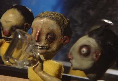
I thought I'd test the ideas of shallow and deep filmic space, which I'm only theoretically familiar with so far. Shallow space is a favorite of Von Sternberg {maybe I've written about him before? Can't recall.... ;) } and I know it can be achieved with a telephoto zoom lens with the camera set pretty far back from the action and zoomed way in. That's how I got the above pic. Notice the way all the puppets look the same size, with no foreshortening of perspective. If they weren't overlapped, it would look like they're all standing side by side for a police lineup. In fact there were about 16 inches between the frontmost and rearmost puppet! I couldn't quite get focus on all of them at once. This technique is used to create a sense that the image is flat like a painting.... it emphasizes the flatness of the screen and doesn't let the viewer feel they could walk into this space.... it distances them from the characters and creates a sense of disconnect between image and viewer.... a favorite among the avant gard because it makes viewers think about the nature of art. The back wall of the set seems to be squeezed right up behind them, and the entire space is squashed flat, with no room to breathe.
Heh... I also played around with some different settings in Framethief, and tried widescreen. But as you can see, all it did was stretch the image out sideways. Also, I apologise for the puppets always being in the same poses.... I don't want to bend them around too much before I pick up my megaphone and shout action.
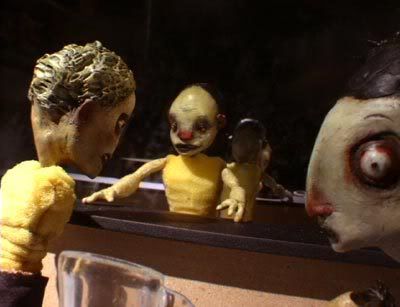
Here's the deep space we're all more familiar (and comfortable) with. I definitely prefer this look. It complements the stopmo aesthetic nicely..... what's the point of building 3 dimensional puppets/sets and then flattening them out photographically? Some people could make good use of shallow filmic space I'm sure, but for now I'm sticking with good old depth! Look how much smaller Cosmo (the bartender) is here than Hoppy (pop-eyed guy up front). His entire head is about as big as Hoppy's eye... now THAT'S some foreshortened perspective! It's funny, I actually moved Hoppy back about 5 inches because it was even harder to get good depth of field (focal depth) this way. This one was shot with a 6mm lens and the camera right up in Hoppy's face.
Setting up for these shots is really showing me the problems I'm gonna have with that mirror. It's hard to find an angle where the camera doesn't show and the light doesn't reflect directly into it and make sunspots. A flag cut from a piece of MDF helps a lot with that, but I can see it's gonna really drive me nuts. If you're gonna have a big mirror in your set, it becomes the most important factor and affects all your other choices. Plus the matte spray I misted it with to make it look dirty can really flare up bright when the light hits it a certain way. Ugly! But I should be able to minimize these problems when I've made some shelves and loaded them with bottles. Then the mirror will only show through here and there. And if it still gives me headaches... out it goes!
One thing I dislike about it is this.... good lighting is more than just how you aim your lights and shape the beams etc.... about half of it consists of what the light falls on.... form, texture, color etc. A flat mirror doesn't give it much to work with!
9 comments:
Depth DEPTH D.E.P.T.H.!!!!!!! depth. LOVE it in the second shot! WOW! And that mirror?! It looks so awesome behind Cosmo I can't stand it! I sure hope you manage to keep it under all the shelves and botts. I also love how the set falls into blackness like that, so artful.
Kurosawa's Seven Samurai uses that flattening telephoto to fantasic effect but it makes sense for that tale. For yours I so dig the emotional involvement the depth is providing you. I want to feel these characters, walk among them. So tactile, so real!
This is going to be epic good.
Yeah, Kurasawa is truly godlike! So much so that Hollywood remade 7 Samurai as The Magnificent 7, and Sergio Leone remade Yojimbo almost frame for frame as Fistful of Dollars.
A lot of movies mix the techniques for different reasons, which makes sense. I'll tell ya what.... it's a nice freedom to have the camera way back to allow the animator free access to the set..... it can be really frustrating to have to reach around it while it's 6 inches from a puppet, and the incessant need to not bump the camera while you work. Ah the sacrifices we make for our art!
Even more interesting, Kurasawa was in love with John Ford American Westerns!
Are you going to fil us in on your camera choice? Is it new?
I'm still using the good old Hitachi HV-C20. Looks like I'll be getting a new lens for it on ebay tomorrow though... give it a nice boost of confidence. Like getting it a new pair of kickass hiking boots or something.
Hmmm.... John Ford eh? That is interesting, though in a way there's a strong similarity. Kura was making "Eastern westerns". Ford's heros are always tough loners on the outside of society, held together by their tough-guy code, like Kurasawa's samurai.
I talked to Misha today, who is kind of out of the loop of discussion at SMA.com's boards, but he said something that stuck with me...
When I asked him why Moral Orel does not employ much shallow focus in the show, he said that it is much easier to tell a story when as much as possible is in focus.
I suggested sculpting the puppet textures with lighting and flatlighting any background elements or details that are too distracting from the foreground; he thought that was a good idea.
So if you ever have background detail work competing with that of the foreground puppets or set pieces, flat-light the sucker!
This all goes back to stage lighting principles, of course. Hopefully, Barry Purves has tackled that in his new book which is set to be released this winter.
Another interesting thing I noticed, is that in a lot of Vinton's stuff, there is no back lighting on the characters. Most of it is pretty flatly (cartoonishly) lit with a subtle key and fill that blend seamlessly together.
This is most apparent on the Cecile sequences. (See Tennessee's recent blog posts)
That's something I want to try one day, when I have a big enough animation table.... the way cinematographers tend to do things.... light the set first and then the actors. For this set, so small and with that massive mirror behind everything, pretty much one light does everything! Maybe two to get light to both ends of the set. But each light provides its own rim lighting (reflected off the mirror) and does all kinds of crazy things to vex me.
Oh man, some really good information on this thread; things of import to think about and try out. Maybe it would be good to put up a "Lighting Techniques" or "Sculpting with Lighting" thread? Maybe in a "Composition" thread?
One thing which fascinates me about cinematography vs painting is that the composition (and of course lighting is a big part of that) has to work for MOVEMENT within the scene. The difference between painting comp and cine comp is like the difference between playing regular chess and three-dimensional chess.
Post a Comment