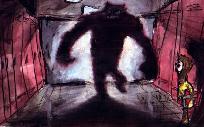
This one is autobiographical. I was a 6th grader, standing there by my locker innocently holding my books when a PO'd 8th grade football player suddenly slammed open the glass double doors and came stalking angrily down the center of the hall with his hamlike fists cocked at his sides. I didn't even see it coming - I don't know what he was so pissed off about, but he slammed me right in the solar plexus and knocked me up against my locker where I gasped for breath for like two minutes after he passed. Immortalized now for the world to see.

6 comments:
Ooo... I really like this one... (not to say that I like the others less) Probably in part because of the drama it captures. Also because of the rich color and contrast, I suspect.
(Lately I've been saying -- because most of my recent sketches have been just black pen -- that "a drawing without color is like a film without sound." So, color drawings a-comin'.)
What media did you use? The white glass doors look like maybe gouache or acrlyic? Washes of...? Lined with charcoal?
It's a great look.
Oooo, God, that is awesome! And even more powerful for the story behind it--it's something when moments in childhood rock our foundation so deeply they come back as art. You've captured something that speaks to the scared kid in all of us...
Me likee too....I love the skewed lockers...is it photoshopped? or painted?
Mortifying moment immortalized marvelously, Mike.
I dunno, Sven, I've seen some mighty fine full volume artworks rendered in a simple ink line. And some black and white films' beauty is still unsurpassed to this day, sound or no sound!
Thanks peeps!
Let's see if I can remember what went into this one.... it's done in a regular Strathmore sketchbook with waterproof India ink, initial tinting done with watercolors, then more color added opaquely with gouache and some additional shading in charcoal I think. And when I scanned it it looked kinda pale, so I pushed the contrast and played around with color balance (I do that to almost everything now.
What really strikes me when I look at it is the way that monster guy totally dominates the composition.... the walls themselves seem to be shrinking away from him, and the shadow from where his foot touches the floor curls out and all the way around the edges of the whole pic, meeting back behind his head!
This is from a period when I was really pushing myself to work fast and rough just to develop some familiarity and comfort with these mixed media and to try to loosen up as an artist... I wanted to break down the barriers beteen a quick sketch and a finished piece (which previously had always been too tight, like coloring book drawings). I scanned in some more from this crazy period last night, but they need some work before posting.
I also downloaded some image stitching software so I can finally scan in some of the pieces that are too big to fit, but it seems to be a bit tricky (or not to work worth crap, remains to be seen which).
Another thing i really like about this one is that it's not just a single figure by itself... it's actually two figures relating to each other in a meaningful way in a full environment. If you look at most od the other ones I've posted it's almost always a lone figure in front of a super-simple backdrop (not even a background in most cases). I'd break it down like this.... the Karate Guy for example, just a few lines behind him to abstractly represent a horizon line... so far away and so simple it counts only as backdrop, not suggesting an environment that wraps around him and defines space in the picture.
My self portrait, in the extreme closeup version, is basically just a sort os swirly backdrop color, like one of those big sheets of patterned paper a photographer hangs behind people. A little nicer than just a plain white or single-color backdrop, but doesn't suggest space or environment. The full srlf portrait could be called a full environment, but only barely. It's mostly just background (I differentiate between backGROUND, which depicts a landscape or interior however abstractly, and backDROP, which looks essentially flat) except I did suggest a couple of closer buildings in the foreground.
The glue gun is sitting in an actual environment, even though it's only a flat tabletop and some indefined space behind it... thanks to the shadow of the gun on the surface beneath it, you get a strong sense of surface and form there, interacting with the object.
And finally the Basement Window piece is a full environment with nothing in it... like an empty stage with a spotlight aimed at no-one. The light itself is the subject. I like the one of my ex GF in the restaraunt with the streetscape visible outside the doors.... it's probably the most complex and multi-layered environment I've done, even though there isn't much of it visible.
Post a Comment