There is something special about these puppets... I cant place it... it is in the finish... The structure is great, but there is a level of detail there that is almost human!
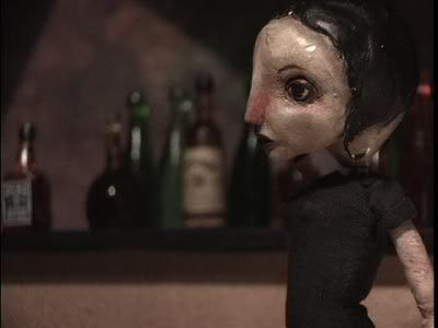
Personally, I like the desaturated photo better than the sepia-tone.
When contemporary filmmakers use sepia-tone or black and white, it often feels inauthentic to me... Like they're just trying to be an "old time" film. (Which is ironic, given that many of the old masters, I suspect, would rather have been working in color!)
With the desaturation, however, it feels like you're making a conscious decision about what color pallette you want to use. Rather than reading as immitative (to me), I see it as an artful choice.
I have similar feelings about adding faux scratchiness to a film. Most of the time it feels inauthentic... I doubt *any* old filmmaker wanted crap on their film!
BUT, that said, I realize that I don't think scratching film should be ruled out entirely... I just want folks who use scratches to have a rationale for doing so that fits with their film, and I want the scratches to be done *artfully* -- rather than with an automatic iMovie filter.
[I suppose even *immitative* scratchy/b&w film can be done well... But if you're trying to pass off your film as having been made in an earlier era, the filmmaker really ought to play the hoax to the hilt.]
Sven, I totally agree about the sepia tone, it was just a quick way to kill off the color, which was too bright and looked tacky. Desaturating creates a film look, bright colors create a cartoon look.
But I must disagree about early filmmakers wanting to work in color. There are a lot of modern misconceptions about early film that can be disspelled by a browse through The Silent Comedians (one of the best books I've ever read period, even better then The Parade's Gone By). Color is like sound in a way.... it works best when it can be controlled by the artist - you want to get rid of the "color noise", and if you work in a controlled palette that helps a lot (monochromatic being the most harshly controlled palette).
Paul! Thanks man!!
Of course, most of the humanity comes from Scott Radke's incredible puppet heads - I've tried my best to bring my semi-noobish skills up to a level where I can sort-of-kind-of match the style of the heads, and it's really helped improve my abilities. And these are by far the best puppets I[ve made yet... completely animatable (Buster couldn't bend his knees or his fingers!) - I can tell it's going to be a joy animating them.
Um - Shelley - were you being clever? "Check out those bottles"..... as in "Nice jugs"? I didn't even get that the first time I read it! (Or am I misreading it now?) Yeah, they're small, but they're [i][b]perky![/b][/i] Actually they're kind of high and hard. But... is that even what you meant? Or am I just reading my own interests into it? ;)
... And Justin, when you said "Im diggin em.... " - Aw, nevermind!!! Definitely getting carried away now.
But hey I came back in to relate my tale of woe! I wanted her shirt (looks like a shirt/dress now) to be really tight, so I used material from an old concert shirt (nice stretch jersey.... great stuff for puppet clothes!). But I failed to taek into consideration the shape of =her body,,,, narrow in the middle and bigger above and below. I can't even tell you how difficult it was to wriggle her into that shirt! I was afraid the seams were going to rip out, or a couple of things were going to suddenly pop right through!!! Thankfully it didn't happen that way, but in the future I'll be more careful when designing clothes for puppets like this.
Let me say this much - originally there was an iron-on transfer on the front of ther shirt, but the trials and travails of getting it back onto her shredded it! Oh well. Hasta la vista baby!
Point well-taken about "color noise" and the old masters wanting to be in control of the image. Really, you address my broader concern there: that as artists we should be making conscious, controlled decisions -- not thoughtlessly imitating.
***
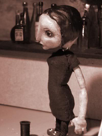
I realized another reason why I like the desaturated look for this particular project...
The way our eyes work, cones give us color vision -- but rods give us black and white. As I understand it, night vision is primarily about using the corners of your vision, which have more rods. Cones, in the center of our range of vision, don't fuction as well in low-light conditions.
SO: By desaturating, you're fairly accurately simulating the low-light conditions of a bar. You're capturing that transition point, where our color vision stops working, and we begin to see the world in black and white.
I don't know about the rationale, but I like the desaturated look best as well. And in her own radkish way, Veronique is pretty hot! It's kind of strange how easily we adjust to the look, and don't apply either the standards of the real world or of Plastic Barbi to the characters. I'm often too constrained by realistic proportions - I should look and learn. Maybe for future tight dresses you need a short section of open seam in the narrowest part of the waist that you hand stitch after she's poured into it. Like a zipper on a real one, only you can't get zippers small enough. (Don't ask how I know about getting into tight frocks!) You've built up some momentum here, congrats on the massive progress!
Hah! I sometimes call her Veronique! Very coquettish.
Nice idea about hand-stitching the tight parts. Kind of like lacing her into a corset.
There is something I really like about the proportioning and look of her.... she's like my Sally (Sally had better legs though). I think she'll be able to speak volumes with just a tilt of the head.
Little factoid.... the "jeans" are just acrylic paint applied directly ot the athletic underwrap! Not sure I'll keep it that way.... the shirt looks too long as is, I'd like to shorten it a bit or even have it tucked into some tight jeans (uh-oh... the T word again!). If I were to do that of course I'd have to actually make some jeans.
That IS a great tip Nick, exactly like lacing a corset. Personally I think I'd lose the pants so that she appears to be wearing a dress, but I'm guessing her legs aren't siliconey?
Very interesting about the color commentary, guys! I've been reading up on bleach bypass, and it works by layering a desaturated color image with black and white, much like the actual chemical process that occurs when you bypass the bleaching agent on celluloid film. As a result, there are more hallide crystals, creating the desaturation. I'm not sure about where the black and white layering with color comes from, but that's how it's described in the wikipedia. I know this is technically not bleach bypass look, but your desaturation of the Veronica puppet kind of reminded me of it.

13 comments:
Congratulations on finishing the cast. Looking great. That was a large accomplishment. And check out those great bottles!
YES man!! congrats on the finishing...
very cool looking pics ya got there too. Im diggin em.
jriggity
There is something special about these puppets... I cant place it... it is in the finish... The structure is great, but there is a level of detail there that is almost human!
Personally, I like the desaturated photo better than the sepia-tone.
When contemporary filmmakers use sepia-tone or black and white, it often feels inauthentic to me... Like they're just trying to be an "old time" film. (Which is ironic, given that many of the old masters, I suspect, would rather have been working in color!)
With the desaturation, however, it feels like you're making a conscious decision about what color pallette you want to use. Rather than reading as immitative (to me), I see it as an artful choice.
I have similar feelings about adding faux scratchiness to a film. Most of the time it feels inauthentic... I doubt *any* old filmmaker wanted crap on their film!
BUT, that said, I realize that I don't think scratching film should be ruled out entirely... I just want folks who use scratches to have a rationale for doing so that fits with their film, and I want the scratches to be done *artfully* -- rather than with an automatic iMovie filter.
[I suppose even *immitative* scratchy/b&w film can be done well... But if you're trying to pass off your film as having been made in an earlier era, the filmmaker really ought to play the hoax to the hilt.]
Oops... Guess one of my buttons got pushed. ;)
Thanks peeps!!!
Sven, I totally agree about the sepia tone, it was just a quick way to kill off the color, which was too bright and looked tacky. Desaturating creates a film look, bright colors create a cartoon look.
But I must disagree about early filmmakers wanting to work in color. There are a lot of modern misconceptions about early film that can be disspelled by a browse through The Silent Comedians (one of the best books I've ever read period, even better then The Parade's Gone By). Color is like sound in a way.... it works best when it can be controlled by the artist - you want to get rid of the "color noise", and if you work in a controlled palette that helps a lot (monochromatic being the most harshly controlled palette).
Paul! Thanks man!!
Of course, most of the humanity comes from Scott Radke's incredible puppet heads - I've tried my best to bring my semi-noobish skills up to a level where I can sort-of-kind-of match the style of the heads, and it's really helped improve my abilities. And these are by far the best puppets I[ve made yet... completely animatable (Buster couldn't bend his knees or his fingers!) - I can tell it's going to be a joy animating them.
I like the desaturated look, it suits the grunginess of a bar room....nice puppet, can't wait to see them all together (and moving even :)
Um -
Shelley - were you being clever? "Check out those bottles"..... as in "Nice jugs"? I didn't even get that the first time I read it! (Or am I misreading it now?)
Yeah, they're small, but they're [i][b]perky![/b][/i] Actually they're kind of high and hard. But... is that even what you meant? Or am I just reading my own interests into it? ;)
And thanks Uba! Mmmmmmm......... Grunginess!
... And Justin, when you said "Im diggin em.... " - Aw, nevermind!!! Definitely getting carried away now.
But hey I came back in to relate my tale of woe! I wanted her shirt (looks like a shirt/dress now) to be really tight, so I used material from an old concert shirt (nice stretch jersey.... great stuff for puppet clothes!). But I failed to taek into consideration the shape of =her body,,,, narrow in the middle and bigger above and below. I can't even tell you how difficult it was to wriggle her into that shirt! I was afraid the seams were going to rip out, or a couple of things were going to suddenly pop right through!!! Thankfully it didn't happen that way, but in the future I'll be more careful when designing clothes for puppets like this.
Let me say this much - originally there was an iron-on transfer on the front of ther shirt, but the trials and travails of getting it back onto her shredded it! Oh well. Hasta la vista baby!
Point well-taken about "color noise" and the old masters wanting to be in control of the image. Really, you address my broader concern there: that as artists we should be making conscious, controlled decisions -- not thoughtlessly imitating.
***
I realized another reason why I like the desaturated look for this particular project...
The way our eyes work, cones give us color vision -- but rods give us black and white. As I understand it, night vision is primarily about using the corners of your vision, which have more rods. Cones, in the center of our range of vision, don't fuction as well in low-light conditions.
SO: By desaturating, you're fairly accurately simulating the low-light conditions of a bar. You're capturing that transition point, where our color vision stops working, and we begin to see the world in black and white.
I don't know about the rationale, but I like the desaturated look best as well.
And in her own radkish way, Veronique is pretty hot! It's kind of strange how easily we adjust to the look, and don't apply either the standards of the real world or of Plastic Barbi to the characters. I'm often too constrained by realistic proportions - I should look and learn.
Maybe for future tight dresses you need a short section of open seam in the narrowest part of the waist that you hand stitch after she's poured into it. Like a zipper on a real one, only you can't get zippers small enough. (Don't ask how I know about getting into tight frocks!)
You've built up some momentum here, congrats on the massive progress!
Hah! I sometimes call her Veronique! Very coquettish.
Nice idea about hand-stitching the tight parts. Kind of like lacing her into a corset.
There is something I really like about the proportioning and look of her.... she's like my Sally (Sally had better legs though). I think she'll be able to speak volumes with just a tilt of the head.
Little factoid.... the "jeans" are just acrylic paint applied directly ot the athletic underwrap! Not sure I'll keep it that way.... the shirt looks too long as is, I'd like to shorten it a bit or even have it tucked into some tight jeans (uh-oh... the T word again!). If I were to do that of course I'd have to actually make some jeans.
That IS a great tip Nick, exactly like lacing a corset.
Personally I think I'd lose the pants so that she appears to be wearing a dress, but I'm guessing her legs aren't siliconey?
Very interesting about the color commentary, guys! I've been reading up on bleach bypass, and it works by layering a desaturated color image with black and white, much like the actual chemical process that occurs when you bypass the bleaching agent on celluloid film. As a result, there are more hallide crystals, creating the desaturation. I'm not sure about where the black and white layering with color comes from, but that's how it's described in the wikipedia. I know this is technically not bleach bypass look, but your desaturation of the Veronica puppet kind of reminded me of it.
Post a Comment